The Haydn A.I. Landing page
And App UI
And App UI

%402x.svg)
The Challenge
Our primary objective was to design and deliver an intuitive and engaging user experience on both Haydn's Landing page and in app UI. The challenge was to effectively showcase HAYDN's unique features and competitive pricing in a way that not only captures users' attention but also builds trust and clarity. This required a careful balance between aesthetics and functionality.
Story behind Hayden AI's landing page & App UI
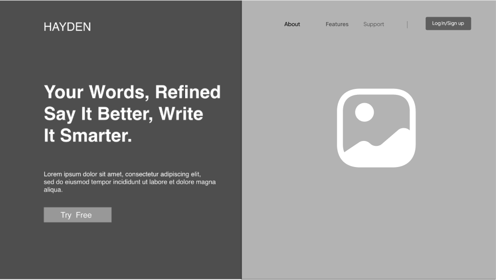
When tasked with sculpting the landing page for HAYDN, the goal extended beyond simply refining its aesthetics or functionality. The project was about creating a welcoming experience that Invited users to learn more about HAYDN and it functionality as a powerful and reliable writing assistant.
User experience was prioritized by prominently displaying HAYDN's unique features and incorporating best practices from popular competitor sites. A S.W.O.T analysis of direct competitors revealed the need for a landing page with a clean design and sections dedicated to pricing, Testimonials, and features as well as multiple CTA's.
There are clear benefit-driven headline and prominent calls-to-action effectively showcase product capabilities. avoiding a cluttered layout.
The simple layout, intuitive navigation, and transparent pricing is great but it falls short in showcasing features.
Jasper A.I. excels in clearly displaying pricing plans, features, and prominent calls-to-action, However, its landing page can feel overwhelming due to excessive information
The competitive audit provided invaluable insights into designing an effective landing page by highlighting what works and what doesn’t in the industry. These findings serve as a roadmap for creating a landing page that not only stands out but also aligns with user expectations and drives conversions. The competitive analysis reveals key takeaways:
The card-sorting results reveal that users prioritize pricing information, core AI features and action-oriented elements like "Sign In," and "Free Trial" as the most important navigation feature. Supporting content, including "Customer Testimonials," "About Us," and "What is Haydn AI," is considered secondary, while blog content holds the least interest.
Card sorting helped create an intuitive site map by organizing the navigation categories Features, About, Pricing, Login/Sign-Up, and a prominent CTA for a Free Trial. This user-centered, data-driven approach significantly enhanced the overall user experience by streamlining navigation, optimizing labeling, and improving content organization.
Haydns Landing page had many Iterations when trying to lock down the a simplistic information architecture. of the landing page.
.png)

.png)
User engagement was a central priority for the client, which made designing highly visible and compelling Call-to-Action (CTA) buttons crucial. By leveraging insights from our competitive analysis and applying user-centered design principles, we strategically placed the CTAs in positions that align with users' natural interaction patterns.
The testimonials have been thoughtfully formatted to ensure they are easy to read across all devices. This section not only helps build trust and credibility but also effectively showcases the value of the product, making it easier for users to connect with.

The payment plans are presented in a dedicated section, This layout allows users to easily navigate and comprehend the different payment options, minimizing confusion and making the decision-making process smoother.

The mobile-first design strategy was implemented to ensure a seamless user experience across all devices, with a particular emphasis on mobile users. Recognizing the increasing use of smartphones for browsing, we prioritized mobile responsiveness from the outset.


HAYDN's style guide specified Rubik as the typeface, chosen for its balanced geometry and curved corners, which convey intentionality and friendliness. To enhance accessibility, I set the line height and paragraph spacing for body text at 1.4 times the font size.
The color palette aligns with Haydn's branding by balancing professionalism and approachability. The Blue evoke trust and reliability, while Sun Gold and Bright red add warmth and energy, reflecting a friendly yet polished tone.
During the final project week, the focus was on developing the mobile app. A detailed analysis of competitors' AI apps revealed key features like text generation templates, a settings section, and access to past outputs. I was provided with a Mid fidelity version of Haydn's Key Screens.
The high-fidelity prototype allows users to be able to see their stats on a dashboard, compose a new document, surface previous documents, browse templates and see their account settings


This project provided valuable experience in designing information architecture based on user testing, pushing me to challenge assumptions and adapt as needed. By considering the user environment and interaction context, I gained insights into effective responsive design. The experience underscored the value of starting with mobile-first design, highlighting the challenges of translating desktop wireframes into purposeful mobile experiences.
Develop user task scenarios and conduct usability testing on the marketing landing page. Gather stakeholder feedback and finalize iterations on the homepage before launch.Complete prototyping for the mobile dashboard and seek stakeholder input to refine the design.
